The Yo! Sushi project was the biggest project i had ever done and i tried to challenge my skills in this brief. I chose Amsterdam because i knew little about it apart from the drugs and sex however i didnt want to choose the obvious cities of London and New York, As the project went on through the research stages i quickly learned about the history of the city and many styles it has. When it came to the mural i wanted to have the freedom to do my own style and not copy someone elses, with Amsterdam not being perfect i reflected that in the imperfection quality of the illustrations, i didnt want to be bolted down to the obvious approach. The mural overall took me a long time but im happy with the results i feel i have developed my illustration skills massively, i ticked all the boxes that i wanted to tick.
After doing my mural i felt very confident in all the other items i needed, the menu started of as something i thought i could wiz through but after creating the style in which it was influenced the mural, i realised that they have a huge menu and it became a problem with my slim menu style but i overcame this problem by making the menu slightly larger. The menu as a finished design is like the mural - unique, both of these items represent the city very well not only that they represent the restaurant just as good. The direct mail and drinks menu gave me the opportunity to have another go at created my style of art, i started going on the theme of "trippy" and "another world" which plays of the drugs associated with the city, i wanted this restaurant to be like another world and thats what the design are intended to look like. The logo is a personal achievement as i have done neon before and it never works but this time i did it well. The design was based of the sign for the red light district which i came across when doing the mural. Finally the wine label which i did leave late but i did end up getting a nice outcome, i feel this is the weakest of all the outcomes.
Overall i feel that the project is adequate, i feel the mural was a real achievement for me and has broke me into new depths, for the project aim i felt i represented Amsterdam brilliantly, my designs have flare, creativity, fun, colour everything you see from Amsterdam and it also shows what Amsterdam about e.g. architecture, nature, canals etc. My time keeping was fantastic at the start but not towards the end and if i was to do the project again i would do everything the same apart from my time keeping and i would go into more depth with my research.
Friday, 7 January 2011
Drinks Menu II
The drinks menu is also complete, its not as good looking as i thought but with no time left i cant change.


Wine Labels II
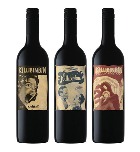
Ive taken parts of the mural and placed them on the wine labels because the mural would be the one thing to separate this restaurant from the rest, so i felt i should incorporate this onto the bottle so that its not just any bottle of wine.


Wine labels
Just a few of the wine labels i looked at whilst designing..


 I like the black styled bottles and i think i will be going for one of them when i come to designing.


Fonts
Throughout the design process i wanted to stick to only a few fonts, i ended up using two familys and they were..


Thursday, 6 January 2011
Brand Report
I was going to hand this in on paper but i lost the one i printed out and due to the rush on print tomorrow i thought id upload it.
Brand Report
Yo! Sushi in its own words is “luxury without the costs” and therefore its for everyone and has a wide audience due to the cheap price of this exotic food, the selling points for this restaurant is its unusual style of restaurant e.g. the way its laid out. You sit near a conveyor belt where you simply pick the food you want, which constantly goes passed you.
The market objectives can be seen by looking at the history of the firm, it has expanded greatly in the UK especially London and its becoming the most popular sushi bar in the UK. It has recently expanded overseas and so the sales targets are simple – expand. The brand loyalty is crucial with this type of restaurant because customers may be excited to eat their due it being unique and if you keep the customers happy they will continue to spread the name by word of mouth however if you change the set up this can be devastating for the company if it goes wrong.
The target audience for Yo! Sushi is around 18-25 but I think it can easily be open to everyone but due to the 18-25 being more mobile it would be targeted towards him or her. The environment is very open and therefore social and so it would target groups of people very easily. To keep their target audience happy they can keep to this unique style they have because the young generation like something different.
The environment for this restaurant is also a unique point of it because it doesn’t need a huge space e.g. the restaurant in meadowhall is in the high street.
I am planning on playing on the Yo! Sushi theme of unique and luxury without the cost therefore I want it to look proffesional i.e. quality of the designs but have an unusual twist to it. As my pick is Amsterdam I have many options available due to its high reputation as a beautiful city but also a sinful city, the illustration style can be anything as Amsterdam has many art museums meaning the styles that would suit the city would be many, I also looked at their wall murals and they don’t seem to have a certain style apart from the huge amount of colour and the incredible creativity.
Subscribe to:
Comments (Atom)