The Yo! Sushi project was the biggest project i had ever done and i tried to challenge my skills in this brief. I chose Amsterdam because i knew little about it apart from the drugs and sex however i didnt want to choose the obvious cities of London and New York, As the project went on through the research stages i quickly learned about the history of the city and many styles it has. When it came to the mural i wanted to have the freedom to do my own style and not copy someone elses, with Amsterdam not being perfect i reflected that in the imperfection quality of the illustrations, i didnt want to be bolted down to the obvious approach. The mural overall took me a long time but im happy with the results i feel i have developed my illustration skills massively, i ticked all the boxes that i wanted to tick.
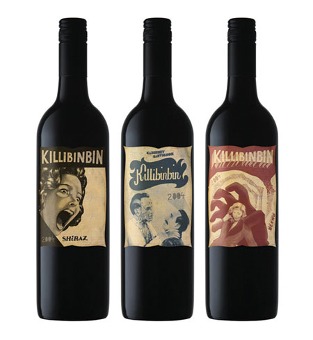
After doing my mural i felt very confident in all the other items i needed, the menu started of as something i thought i could wiz through but after creating the style in which it was influenced the mural, i realised that they have a huge menu and it became a problem with my slim menu style but i overcame this problem by making the menu slightly larger. The menu as a finished design is like the mural - unique, both of these items represent the city very well not only that they represent the restaurant just as good. The direct mail and drinks menu gave me the opportunity to have another go at created my style of art, i started going on the theme of "trippy" and "another world" which plays of the drugs associated with the city, i wanted this restaurant to be like another world and thats what the design are intended to look like. The logo is a personal achievement as i have done neon before and it never works but this time i did it well. The design was based of the sign for the red light district which i came across when doing the mural. Finally the wine label which i did leave late but i did end up getting a nice outcome, i feel this is the weakest of all the outcomes.
Overall i feel that the project is adequate, i feel the mural was a real achievement for me and has broke me into new depths, for the project aim i felt i represented Amsterdam brilliantly, my designs have flare, creativity, fun, colour everything you see from Amsterdam and it also shows what Amsterdam about e.g. architecture, nature, canals etc. My time keeping was fantastic at the start but not towards the end and if i was to do the project again i would do everything the same apart from my time keeping and i would go into more depth with my research.
Friday, 7 January 2011
Drinks Menu II
The drinks menu is also complete, its not as good looking as i thought but with no time left i cant change.


Wine Labels II
Ive taken parts of the mural and placed them on the wine labels because the mural would be the one thing to separate this restaurant from the rest, so i felt i should incorporate this onto the bottle so that its not just any bottle of wine.


Wine labels
Just a few of the wine labels i looked at whilst designing..


 I like the black styled bottles and i think i will be going for one of them when i come to designing.


Fonts
Throughout the design process i wanted to stick to only a few fonts, i ended up using two familys and they were..


Thursday, 6 January 2011
Brand Report
I was going to hand this in on paper but i lost the one i printed out and due to the rush on print tomorrow i thought id upload it.
Brand Report
Yo! Sushi in its own words is “luxury without the costs” and therefore its for everyone and has a wide audience due to the cheap price of this exotic food, the selling points for this restaurant is its unusual style of restaurant e.g. the way its laid out. You sit near a conveyor belt where you simply pick the food you want, which constantly goes passed you.
The market objectives can be seen by looking at the history of the firm, it has expanded greatly in the UK especially London and its becoming the most popular sushi bar in the UK. It has recently expanded overseas and so the sales targets are simple – expand. The brand loyalty is crucial with this type of restaurant because customers may be excited to eat their due it being unique and if you keep the customers happy they will continue to spread the name by word of mouth however if you change the set up this can be devastating for the company if it goes wrong.
The target audience for Yo! Sushi is around 18-25 but I think it can easily be open to everyone but due to the 18-25 being more mobile it would be targeted towards him or her. The environment is very open and therefore social and so it would target groups of people very easily. To keep their target audience happy they can keep to this unique style they have because the young generation like something different.
The environment for this restaurant is also a unique point of it because it doesn’t need a huge space e.g. the restaurant in meadowhall is in the high street.
I am planning on playing on the Yo! Sushi theme of unique and luxury without the cost therefore I want it to look proffesional i.e. quality of the designs but have an unusual twist to it. As my pick is Amsterdam I have many options available due to its high reputation as a beautiful city but also a sinful city, the illustration style can be anything as Amsterdam has many art museums meaning the styles that would suit the city would be many, I also looked at their wall murals and they don’t seem to have a certain style apart from the huge amount of colour and the incredible creativity.
Wednesday, 8 December 2010
Drinks Menu
I was going to do typefaces at my next post but i just did this and while its still fresh in the memory, ill do it now.
The drinks menu was an unusual one as i didnt want to take anything away from the sushi menu i created therefor this cant be a weird shape, i was thinking about just updating the current YO! Sushi drinks menu which is this..
 This isnt much work on this. Couple of rounded rectangles, a visual of a cat with a speech bubble, a logo and URL, title with images and on "Fizz" theres bubbles. I dont like this its boring, plain however it does read well but i want mine to look amazing as this is Amsterdam and it needs more creativity.
This is my first try at a drinks menu, theres no text but it will be the same fonts used in the menu.
 This is what was in my head... Not very good at all but i thought it would look good, i tried to put the waterfall in but it doesnt looks right, i then developed it more and got this..
 Using the bottle as the title was an experiment and it didnt pay off, it doesnt look good, i put the city which is on the mural behind the boxes but its too hard to see and it will ruin it if it stays like that.
What am i doing its the same layout and still nothing better than the original...
Ok new idea!
Going with this a new world theme mixed with japanese and amsterdams nature side i decided to do a menu with life, the first idea i had was instead of having rounded rectangles why not have flowers and they come up on their stem and the go into a flower. Not being the best at drawing and not having much hope in this idea i played around in illustrator and got this...
 They have a japanese style to them and fit with the current style of the mural. When i did this i thought where would the text go? it could go in the flower but may be hard to read when the flowers are next to each other, the other idea is to have the boxes on top of them but that would destroy my design... ill try another way.
I decided to make the menu a 3rd of a a4 sheet therefor it stands well with the menu.
The menu now smaller gave me a new idea, the idea is having a tree on a very small island in water, the tree goes all the way up and the boxes go in the tree. Its a different world in this YO! Sushi and this idea is much more creative and art-y.
This is what i came up with, its still unfinished but i think im going to stick with this...

The drinks menu was an unusual one as i didnt want to take anything away from the sushi menu i created therefor this cant be a weird shape, i was thinking about just updating the current YO! Sushi drinks menu which is this..

This is my first try at a drinks menu, theres no text but it will be the same fonts used in the menu.


What am i doing its the same layout and still nothing better than the original...
Ok new idea!
Going with this a new world theme mixed with japanese and amsterdams nature side i decided to do a menu with life, the first idea i had was instead of having rounded rectangles why not have flowers and they come up on their stem and the go into a flower. Not being the best at drawing and not having much hope in this idea i played around in illustrator and got this...

I decided to make the menu a 3rd of a a4 sheet therefor it stands well with the menu.
The menu now smaller gave me a new idea, the idea is having a tree on a very small island in water, the tree goes all the way up and the boxes go in the tree. Its a different world in this YO! Sushi and this idea is much more creative and art-y.
This is what i came up with, its still unfinished but i think im going to stick with this...

Menu
Ok get ready cause this post is my whole menu development and ideas, lets hope it isnt long..
I wanted to have a menu that had something different about it, it had to be a "woah" when you pick it up, rather than just pick it up and see what you want, i want a pause in between them two stages where the customer admires the menu.
Rectangle shape? Square? It has to relate to Amsterdam.. Something todo with water? no. I started looking at other menus to get inspiration but im not going to show any as none inspired me, i then think about the icon making in my direct mail which i didnt use and i thought i could use the shape of the house i created for the menu. The icon is in the direct mail II post.
Ok, i got the shape and so now it should be easy just to fill it in.. I then download the YO Sushi menu and wow its huge and it kind of ruins my idea, my house was thin and long and the amount of food they sell, it wont be able to fit on never the less im going forward and it should work.
The scale i started with is that the height is the same as A4 and the width is half A4 so one folded open its the same size as A4.
This is my first attempt at some sort of grid system..
 I tried this them thought about a 2 column grid but i thought that would mean excess pages and it would be too little information on one page. I printed this out so i could see if the text was readable, the text is about 6pt and is just readable so i might have to enlarge my scale.
I re looked at the YO Sushi menu and they have a menu for sushi and a menu for hot food so i decided to have two menus but just do one as they would be the exact same apart from title colours and content. I got to the decision of two separate menus after seeing that one menu would be too thick due to the mass of food YO Sushi sells.
As ive done the mural and the mural the style doesnt need much research as im already there so i went straight in and did the front and back of the menu...
 The back is an abstract design based on the plate colours, this page would be blank so why not brighten it up. The front is of a typical Amsterdam house and is in the same style as the mural, instead of having the YO! logo in the corner i incorporated it into the design by having it as a sign in the window. Im pretty happy with the results as i have printed this out and it looks awesome having a little house sat there.
I started to think about what will be in the menu. In the YO sushi menu it goes in this order:
1.How to YO! - 2.sashimi
3.Maki/futomaki - 4.iso
5.Nigiri - 6.gunkan (nigiri goes over onto gunkan page)
7.Hand rolls - 8.Salads
I wrote it like this so i could see it as double page spreads so i could see the prints needed e.g. 2 back to back prints and a single page back to back. (includes front and back)
With my style i cant just have one type of sushi because the gap would be too big so i would have to put 2 types on, my layout would go like this:
1. How to YO! - 2. Sashimi & Maki/futomaki
3. Iso & Nigiri - 4. Gunkan & Handrolls (reverse these two so Nigiri can go over to Gunkan)
5. Salads - 6. Design
This layout is the best ive come up with as i did have m few more but this has the best amount of pages when it comes to printed because its just 2 double pages back to back which is easier to put together.
Anywho the design...
 1st attempt
This is the How to YO! page and an example of what each page layout will look like. I continued the strip across the title but think it doesnt look professional, the how to page is a redeveloped version of the original. I changed the type face (will post my typefaces in next post), i changed the writing font - Tahoma to a new slim Walkaway downloaded from Dafont.com and free to use, the new font looks much better than Tahoma.
2nd attempt
 I updated the first attempt and gave it a more creative feel as i want to have the theme of "enter our world" an have this yo sushi as another world especially as its in Amsterdam. I moved the title down and left aligned it with the subtitle underneath, reduced the title font size and made the how to page look much better. The menu has a nice look to it and the food looks much better by being represented by nice visuals and fonts around it. I decided to have either full blue speech bubbles or white with blue outline as in the YO! Menu they have all orange and white with orange.
The menu looks great and it fits YO! Sushi well, its friendly, fun, creative and its unique. Luxury without the cost (the goal of YO! Sushi).
The development for the rest of the pages are more of "if there's space then ill put something there" as there is so much food some pages there is no room. Before i started designing the other pages i realised that when it comes to print the pages will be in different order and i have learned from past experience this can get confusing so i decided to design in that sequence, now when it comes to print i will already be prepared.
This is the rest of the pages..
 This is the 1st page on the left and the last page on the right, i decided to put this design inside therefor i need a new design for the back of the menu.
 This is the 5th page on the left and 2nd on the right, this is because of printing but you can see i have put a visual on the last page (salads) to fill in the space, it advertises the companies social sites and i put it at the end because it seems like a better place rather than being in the middle and anoying you when your looking for food.
 This is the 3rd page on the left and 4th on the right. I had to reverse Gunkan with handrolls because the nigiri goes over to the gunkan page and to cooperate that i put i long line in going from the nigiri section to the gunkan. There is a small visual which has the japanese woman saying about YO!'s contribution to saving the planet by not using bottles.
The front you have seen and i have not doe the back yet.
Im still concerned about the size but if it comes to it ill print it a bit larger, i was thinking of putting something in the blank tops of each page apart from that im pleased with the menu and it was a risk to do it like this rather than the obvious rectangle or square but i think it may pay off.
I wanted to have a menu that had something different about it, it had to be a "woah" when you pick it up, rather than just pick it up and see what you want, i want a pause in between them two stages where the customer admires the menu.
Rectangle shape? Square? It has to relate to Amsterdam.. Something todo with water? no. I started looking at other menus to get inspiration but im not going to show any as none inspired me, i then think about the icon making in my direct mail which i didnt use and i thought i could use the shape of the house i created for the menu. The icon is in the direct mail II post.
Ok, i got the shape and so now it should be easy just to fill it in.. I then download the YO Sushi menu and wow its huge and it kind of ruins my idea, my house was thin and long and the amount of food they sell, it wont be able to fit on never the less im going forward and it should work.
The scale i started with is that the height is the same as A4 and the width is half A4 so one folded open its the same size as A4.
This is my first attempt at some sort of grid system..

I re looked at the YO Sushi menu and they have a menu for sushi and a menu for hot food so i decided to have two menus but just do one as they would be the exact same apart from title colours and content. I got to the decision of two separate menus after seeing that one menu would be too thick due to the mass of food YO Sushi sells.
As ive done the mural and the mural the style doesnt need much research as im already there so i went straight in and did the front and back of the menu...

I started to think about what will be in the menu. In the YO sushi menu it goes in this order:
1.How to YO! - 2.sashimi
3.Maki/futomaki - 4.iso
5.Nigiri - 6.gunkan (nigiri goes over onto gunkan page)
7.Hand rolls - 8.Salads
I wrote it like this so i could see it as double page spreads so i could see the prints needed e.g. 2 back to back prints and a single page back to back. (includes front and back)
With my style i cant just have one type of sushi because the gap would be too big so i would have to put 2 types on, my layout would go like this:
1. How to YO! - 2. Sashimi & Maki/futomaki
3. Iso & Nigiri - 4. Gunkan & Handrolls (reverse these two so Nigiri can go over to Gunkan)
5. Salads - 6. Design
This layout is the best ive come up with as i did have m few more but this has the best amount of pages when it comes to printed because its just 2 double pages back to back which is easier to put together.
Anywho the design...

This is the How to YO! page and an example of what each page layout will look like. I continued the strip across the title but think it doesnt look professional, the how to page is a redeveloped version of the original. I changed the type face (will post my typefaces in next post), i changed the writing font - Tahoma to a new slim Walkaway downloaded from Dafont.com and free to use, the new font looks much better than Tahoma.
2nd attempt

The menu looks great and it fits YO! Sushi well, its friendly, fun, creative and its unique. Luxury without the cost (the goal of YO! Sushi).
The development for the rest of the pages are more of "if there's space then ill put something there" as there is so much food some pages there is no room. Before i started designing the other pages i realised that when it comes to print the pages will be in different order and i have learned from past experience this can get confusing so i decided to design in that sequence, now when it comes to print i will already be prepared.
This is the rest of the pages..


The front you have seen and i have not doe the back yet.
Im still concerned about the size but if it comes to it ill print it a bit larger, i was thinking of putting something in the blank tops of each page apart from that im pleased with the menu and it was a risk to do it like this rather than the obvious rectangle or square but i think it may pay off.
Monday, 29 November 2010
Direct mail part II
Today i glanced over at the work i did last night which was the whole of my direct mail and i saw a few tings i wanted to change; on the front i wanted the orange bowl to be deleted due to me not liking it and the mid section didnt feel right and i just couldnt work it out anyway cutting a long story short i printed a test and put the booklet/card together and saw that it looks like theres a page missing and that they dont work together, i had ideas on putting in an extra page and i even drew what it would look like..
PICTURE HERE
The only thing that stopped me was that i couldnt work out how i would add just one double sided sheet (15cmx15cm not a double spread) into the booklet and with time running out i thought that it just wasnt going to work with the limited time i have left and so i decided to give the middle a makeover.
The information bowl looked very plain inside and i thought aout adding icons..
 This would of been the home icon, i then had the phone and a pc screen and the earth for the internet but after creating the house styled in the theme of amsterdam which is shown below..
 I felt that the icons didnt look that good and there became a feature i quickly disliked.
I began work on he makeover and this was the first nice looking style i got to..
 You can see where im trying to go, im trying to get it to merge as one image rather than 2 seperate pages. This design is a bit too simple and so i developed it more and i got this..
 In this design i changed the type of the left because you already know its YO! Sushi because you have seen the front and it doesnt need repeating, i replaced it with a short sentence that runs of the different world theme, the sentence implies that this sushi is out of this world and its the best in our (the publics) world. I made the information bowl part of the design by firstly continuing the water across the page and having the bowl looking like its float on the water by adding a shadow/reflection. Overall im very happy with this its much better than before, the only thing i still dont like and im not too sure if i will update is the information in the bowl.
PICTURE HERE
The only thing that stopped me was that i couldnt work out how i would add just one double sided sheet (15cmx15cm not a double spread) into the booklet and with time running out i thought that it just wasnt going to work with the limited time i have left and so i decided to give the middle a makeover.
The information bowl looked very plain inside and i thought aout adding icons..

I began work on he makeover and this was the first nice looking style i got to..


Direct Mail
So i now move on to the direct mail first off what is direct mail?


 YO! Sushi's style seems to be very playful which is good because ive got a very playful city to design for! They seem to use vector, type and photos in their advertising and a lot of orange and white.
Anywho.. I did a front cover of my own and this is completely different to the YO! style as it fits the logo but it makes more sense when you see the inside. I chose to do a card type of design (greeting card style) which has a front, a back and 2 middle pages, the size is 15cmx15cm as i think a square is a much better shape than a rectangle. This is the front..
 The orange bowl may come out as im not too sure on it.
After designing this i thought its not much of a creative front but the reason its like this is because when you first glance at it you will see the bright colours which will grab your attention, when you open it you will then be overwhelmed with colour. The slogan if i decide to use it will be "Step into our world" this means that you enter a new world when you come here because its unique and there's nothing like it, also it plays off the drug side of Amsterdam as its a "trip", a new world.
This is the first idea for the middle parts..
 The first page introduces that YO! Sushi has arrived and the size of the text is large so its the first thing you see. The font is Rockwell which is the same as the logo, the different shades of orange in the background came from an old YO! Sushi advertising campaign (see above), you have a small sentence this again was on an old advertising campaign and so i thought id update it. Overall the first page is bright and colourful like i wanted it but im not too keen on the orange in the background and something about the whole page doesnt feel right so im going to develop it more. The second page is photos of the restaurant as its always nice to see where your going especially when im going to be using the words "step into our world", i want the customers to be excited not nervous and paranoid about what to expect however i feel these 2 pages together causes alot of clutter and therefor i think im going to put the images of the restaurant on the back page.
I developed the concept above and my middle page now looks like this..
 Just looking t it and you get a better feeling than the previous one. On the first page i changed the background colour to a better colour (i cant put it any other way), the pale yellow on the old one wasnt nice to look at but this blue/green is much better it also gave me an opportunity to ad more colours unlike the yellow to orange. The short sentenced is deleted to make way for the smoke from the mural as i feel the design suits YO!'s style especially the colourful plates i added more plates and i changed the "IS HERE" to the colour of one of the plates because i started thinking why dont i just use colours hat they use for plates as its much easy to recognize in the long run. The second page was originally going to be the back but i changed ideas and put it here, this page is the information page as its just opened and most people wont have a clue where it is therefor its a necessary. The page has; address, telephone number, website and opening times, this information also means people may hang on to this unlike the other direct mail which would be thrown out, this card design means you can either have the front and back as the front and back or flip it inside out and have the middle pages as front and back, you then pin it up on your wall or keep it in your draw. Nice designs + useful information = a keeper.
The back of the card is the images you saw before..
 I thought id add this text because i think it gives it that sparkle that it needs. I was very conscious about how the text will stand out e.g. i didnt want to use a one off shape that isnt used anywhere else, but i realized i used a rounded box for the opening times and that was because they use the rounded boxes on their website and therefor i used it.
The whole concept behind this design is that you get this through the post, open it, you see the black front with just the new logo and "Now open" and you have no idea what it is until you realize you can open it, you open it and you see the amazing colour design within and it is like going into a new world, you then see the information, you see the site, you either look at the site or look at the back and you re bombarded with this message that YO! Sushi is here and that its a unique new place - a new world and its unlike any other. All of it added together should create an interest straight away and then you pin this up on your wall or you can even stand it up!
- Postcard
- Leaflet
- Brochure
- Flyer
- Booklet
- Business card


Anywho.. I did a front cover of my own and this is completely different to the YO! style as it fits the logo but it makes more sense when you see the inside. I chose to do a card type of design (greeting card style) which has a front, a back and 2 middle pages, the size is 15cmx15cm as i think a square is a much better shape than a rectangle. This is the front..

After designing this i thought its not much of a creative front but the reason its like this is because when you first glance at it you will see the bright colours which will grab your attention, when you open it you will then be overwhelmed with colour. The slogan if i decide to use it will be "Step into our world" this means that you enter a new world when you come here because its unique and there's nothing like it, also it plays off the drug side of Amsterdam as its a "trip", a new world.
This is the first idea for the middle parts..

I developed the concept above and my middle page now looks like this..

The back of the card is the images you saw before..

The whole concept behind this design is that you get this through the post, open it, you see the black front with just the new logo and "Now open" and you have no idea what it is until you realize you can open it, you open it and you see the amazing colour design within and it is like going into a new world, you then see the information, you see the site, you either look at the site or look at the back and you re bombarded with this message that YO! Sushi is here and that its a unique new place - a new world and its unlike any other. All of it added together should create an interest straight away and then you pin this up on your wall or you can even stand it up!
Logo Development
Ive already got the YO! Sushi part done and now i need to add the "Amsterdam" part.
I went through a few typefaces that i thought represented Amsterdam well, could be used in different situations e.g. direct mail, menu. The typeface had to work good if it ended up being a neon sign so that meant that complex fonts werent acceptable.
These are the typefaces are narrowed it down to..
 I really like Bebas Neue as its a strong font and the capitals look great, the font also rminds me of the building in amsterdam and haw they are so colose to each other and the tallness of the font reminds me of the buildings, Rockwell Extra bold is my favourite as i like the parts at the bottom of each letter and it could represent the reflection in the water and the rest of the letter are the buildings, the rest are ok but nothing really stands out. The Rosewood Std is amazing but i dont think you could have that font on a neon sign and so i cannot use it, the same goes for Lapointes Road it was better than the rest but when i had to choose the one i wanted it didnt fit the criteria.
The chosen font is.... ROCKWELL EXTRA BOLD!
This font has a thinner font styles and i could use this in their advertising and menu's.
I went through a few typefaces that i thought represented Amsterdam well, could be used in different situations e.g. direct mail, menu. The typeface had to work good if it ended up being a neon sign so that meant that complex fonts werent acceptable.
These are the typefaces are narrowed it down to..

The chosen font is.... ROCKWELL EXTRA BOLD!
This font has a thinner font styles and i could use this in their advertising and menu's.
Sunday, 28 November 2010
Next up... The Logo
"Using the existing Yo! Sushi logo you are required to apply elements of the city's 'brand" ethos.... Each brand extension of the logo for your chosen city, should include the name of the city or town.... The existing logo is to be used but with a new typeface for supporting elements that will allow consistency and uniformity across the company's signage, lettering and typographic style."
The brief.
This is the logo Yo! Sushi have at the moment..
 Very simple, nice bright colours to see and an all round nice logo to have.
Anywho i have to create a Amsterdam styled logo, the logo must have something that can relate to Amsterdam and this is harder for me as i dont have a easy city e.g. London or New York and i dont ant to have any drug related images on the logo as the target audience is so wide some may not appriciate a cannabis leaf.
First thoughts were:
- Background is in the shape of a building
- There is a partition at the bottom and then a bridge
- The logo looks like a window
I got very frustrated with this logo idea as nothing really stood out but i thought i may aswell try and maybe it will come out better... I tried the first idea and this is what it looked like..
 I did this and thought what the hell have i created, it looks nothing like a building and the gap looks terrible and the font doesnt go. I tried have 3 houses above but it still didnt work and so i scraped the 3 ideas above and start thinking about what is Amsterdam..
What is Amsterdam?
- Nightlife
- Creativity
- Ethinic
- Nature
- Water
- Boats
None of my thoughts made sense but i then had an idea for the font, i did a red light district neon vector in my mural and i thought i could do the "Amsterdam" in neon and so i carried on thinking "ok what about the rest" and then it hit me, why not all neon? The neon plays of the red light district and the moulin rouge lights but it also combines a Japanese taste to the logo as it will be neon and Japan is full of light based signs. In my head i had an image of a sign outside the Yo! Sushi bar which is actual neon and lit up.
I started looking at neon signs before i started so i could do a neon effect as i have never played with neon before..(source: http://abduzeedo.com/awesome-nostalgic-neon-signs)


 My own tips for myself when looking at these so i can have a good neon look:
- The neon tube is lighter than the light produced
- Different syle of neon
- Tube that can go all the way around the image
- Tube that can only go in sections so there are gaps
- Some neon signs have a backboard with the lettering in solid colour normally white
- Neon is just the outline and not the fill
I looked at a few tutorials and different neon fonts..
Tutorials:
http://www.photoshopsupport.com/tutorials/cb/neon-sign.html (not what i wanted)
http://layersmagazine.com/night-lights-creating-a-glowing-neon-effect.html (Good but i felt i could do it another way)
Fonts:
http://www.fontspace.com/category/neon
They didnt really help me out much...
I thought to myself after looking at the tutorials and fonts that i have the capability to look at the images and recreate it by myself.
My first idea was the have a single strip of neon in each letter...
 I liked the idea and the neon works really well but before i move on i had another idea of having an outline instead of doing the fill (sticking to my own rules).
This is my second idea, the idea is that the neon is a style where it cant go all the way round and has that neon look to it, it also goes round the outline..
 I feel this is much better than my first idea and so im scraping idea 1. I have a few problems with this, the first being it looks very cartoon-y and not very neat but it does look like a neon sign however i was thinking about having a neon strip over each outline or letter in solid colour behind the neon but im afraid that it might take the focus away from the neon.
My third idea is to have neon that can go all the way round each outline, i also changed the shape to landscape and no orange outline..
 This is much more like it and when put with the other two it puts them to shame, this looks professional, aesthetically pleasing and much brighter. I still have to add amsterdam into the logo but i have done the Yo! Sushi part and i really like the neon effect.
To get the neon effect on each idea i created the path in illustrator, brought it into photoshop where i added a colour overlay to the line, an outer glow and following the rules what i found out from my neon sign examples i was able to get the colours right.
The brief.
This is the logo Yo! Sushi have at the moment..
Anywho i have to create a Amsterdam styled logo, the logo must have something that can relate to Amsterdam and this is harder for me as i dont have a easy city e.g. London or New York and i dont ant to have any drug related images on the logo as the target audience is so wide some may not appriciate a cannabis leaf.
First thoughts were:
- Background is in the shape of a building
- There is a partition at the bottom and then a bridge
- The logo looks like a window
I got very frustrated with this logo idea as nothing really stood out but i thought i may aswell try and maybe it will come out better... I tried the first idea and this is what it looked like..

What is Amsterdam?
- Nightlife
- Creativity
- Ethinic
- Nature
- Water
- Boats
None of my thoughts made sense but i then had an idea for the font, i did a red light district neon vector in my mural and i thought i could do the "Amsterdam" in neon and so i carried on thinking "ok what about the rest" and then it hit me, why not all neon? The neon plays of the red light district and the moulin rouge lights but it also combines a Japanese taste to the logo as it will be neon and Japan is full of light based signs. In my head i had an image of a sign outside the Yo! Sushi bar which is actual neon and lit up.
I started looking at neon signs before i started so i could do a neon effect as i have never played with neon before..(source: http://abduzeedo.com/awesome-nostalgic-neon-signs)


- The neon tube is lighter than the light produced
- Different syle of neon
- Tube that can go all the way around the image
- Tube that can only go in sections so there are gaps
- Some neon signs have a backboard with the lettering in solid colour normally white
- Neon is just the outline and not the fill
I looked at a few tutorials and different neon fonts..
Tutorials:
http://www.photoshopsupport.com/tutorials/cb/neon-sign.html (not what i wanted)
http://layersmagazine.com/night-lights-creating-a-glowing-neon-effect.html (Good but i felt i could do it another way)
Fonts:
http://www.fontspace.com/category/neon
They didnt really help me out much...
I thought to myself after looking at the tutorials and fonts that i have the capability to look at the images and recreate it by myself.
My first idea was the have a single strip of neon in each letter...

This is my second idea, the idea is that the neon is a style where it cant go all the way round and has that neon look to it, it also goes round the outline..

My third idea is to have neon that can go all the way round each outline, i also changed the shape to landscape and no orange outline..

To get the neon effect on each idea i created the path in illustrator, brought it into photoshop where i added a colour overlay to the line, an outer glow and following the rules what i found out from my neon sign examples i was able to get the colours right.
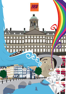
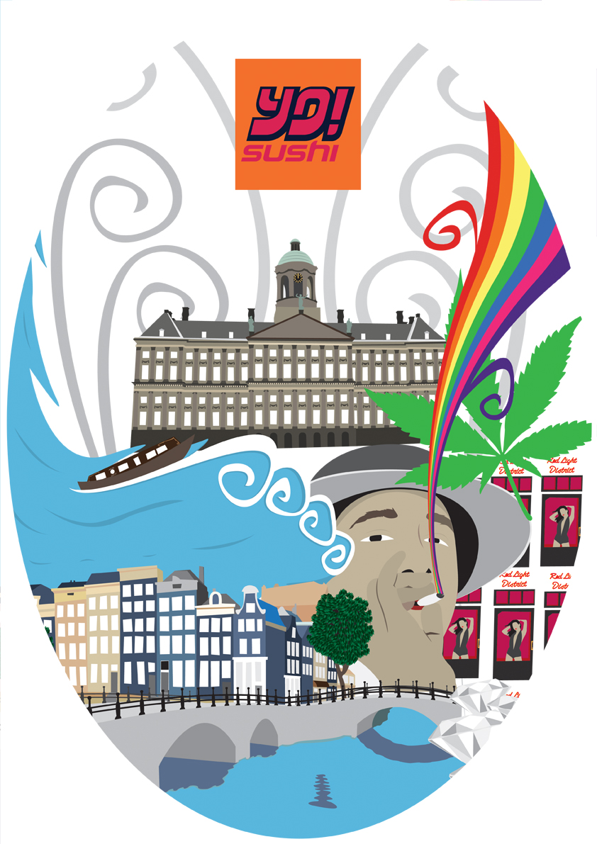
The Mural
SOOOOOOO its here! Yes! I have (kinda) finished it!
I was still deciding on certain sizes of vectors and filling gaps in but i have got a design that i would push for print.
 This has come out fantastic! I started getting to a point where i was thinking its too cluttered and you eyes just wandered but i think i have fixed that now.
Your eyes now start at the royal palace and then are dazzled by the colours and you find yourself lost in the design.
I added marijuana leaves behind the hookers as i tried different solid colours but it didnt look right and so i had a small idea of utting leaves there and it worked nicely, i made the royal palace smaller because the right side was cut off before making it seem unbalanced, i added clouds and changed the background colour to blue and the main reason for this was because whites too obvious, blacks too dark but this nice sky blue gives off a positive vibe and clouds are always a nice feature plus you cant have water without clouds. I may change the colour of the spiral lines, i still need to add the statue at the top of the royal palace and i will add a bike or two.
What the mural covers:
- Amsterdam architecture.
- Amsterdam streets
- Canal
- Bridges
- Nature
- Diamonds
- Red light district
- Marijuana
- Art (colours and style of mural)
- Royal Palace
- Boats
Still to add:
- Bikes
I was still deciding on certain sizes of vectors and filling gaps in but i have got a design that i would push for print.

Your eyes now start at the royal palace and then are dazzled by the colours and you find yourself lost in the design.
I added marijuana leaves behind the hookers as i tried different solid colours but it didnt look right and so i had a small idea of utting leaves there and it worked nicely, i made the royal palace smaller because the right side was cut off before making it seem unbalanced, i added clouds and changed the background colour to blue and the main reason for this was because whites too obvious, blacks too dark but this nice sky blue gives off a positive vibe and clouds are always a nice feature plus you cant have water without clouds. I may change the colour of the spiral lines, i still need to add the statue at the top of the royal palace and i will add a bike or two.
What the mural covers:
- Amsterdam architecture.
- Amsterdam streets
- Canal
- Bridges
- Nature
- Diamonds
- Red light district
- Marijuana
- Art (colours and style of mural)
- Royal Palace
- Boats
Still to add:
- Bikes
Saturday, 27 November 2010
Make Over
Im getting to that stage now where ive looked at this design for so long that im starting to not like it, this always happens and so i started playing around with the vectors i created as im not going to do much more.
Heres my playing surface..

I thought id show you this as it shows ideas that i havent put up on the blog such as the weed leaf rainbow and the Warhol soup idea but with the windows hookers.
I had a few different looks as i was moving things around but nothing special to show however i did get to a point where i liked what i had done.
This is the first one..
 I really like this design, it looks like the old one but with big tweeks. I was having problems with; the royal palace, the hookers and the weed smoker as i just couldnt get them all to look good, i got the hooker and smoker placed well but then the royal palace couldnt fit anywhere but in this they all work great together. I added the marijuana leaf as i find the shape of the leaf is amazing and as its a vector it looks great when its big, the spiral vector lines where put there to fill in the gap but i think it works nicely and suits the rest of the mural and finally the hooker girls are presented differently because i started thinking about the quantity of them and how it is always mentioned and so i thought this Warhol Campbell's soup theme looked much better.
I tried it in black as well...
 The reason for the black is because Amsterdam has a lot a marijuana and shrooms are legal as well so i want to make look tripp-ier and having a back background gives the design some depth and makes the colours stand out much more, im still undecided which background colour to have.
Another idea i have was to change the shape of the design and here is what i came up with..
 This was the rounded edges look but it was basicly the same so this is scrapped however i change the shape to an oval and really liked it, i did 3 versions with different backgrounds..


 I really like this shape but i feel it cuts out too much and therefor im not going for this but i will develop it more on the side.
Finally i created this one, you would of sen this on my play surface(see above)...
 In this one everything is more bigger especially the Royal palace and the best thing i like about this one is that there are not as many gaps as the old ones but the big images may be too big and there is a lot cut of this design most of all being the royal palace... I think im nearly finishing though which is great and for the mural i might add some nature and scale things down.
Heres my playing surface..

I thought id show you this as it shows ideas that i havent put up on the blog such as the weed leaf rainbow and the Warhol soup idea but with the windows hookers.
I had a few different looks as i was moving things around but nothing special to show however i did get to a point where i liked what i had done.
This is the first one..

I tried it in black as well...

Another idea i have was to change the shape of the design and here is what i came up with..


Finally i created this one, you would of sen this on my play surface(see above)...

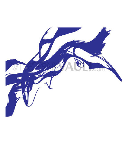
Vector Smoke
Since doing the guy smoking ive been trying to create vector smoke but i just cant get it right, smoke is simple todo but i want this to be different and to have an unusual look and feel.
I started by doing my own smoke but this turned out to look terrible..
 And so instead of thinking i could do it straight away, no problem, i started to look at other smoke vectors..
 I liked this one because it was different and it gave me an idea to write "AMSTERDAM" in smoke but it wasnt what i wanted.
 This kind of smoke was the most popular when researching but it has gradients and opacity levels which none of the mural has and so it wouldnt fit.
 This image really caught my eye and i thought this would work perfectly! It is a bit tribal but if i do it my own way i think it wont look as tribal. I decided to go with this tribal looking design but when it came to actually doing this i felt it wouldnt work as well as i thought, the problem wasnt in the window but when it comes out of the window, i want it to be not to bulgy and thick because it wouldnt match up with the slim waterfall at the other side.
 As you can see i only did a rough design of what it would be but this was because i started to dislike the idea... Back to the drawing board.
After being constantly annoyed by this smoke i went back to research and thought they must be something out there to help me with this and to my luck i did, i found these two images..

 When i saw the first one i came up with the idea to use colour instead of boring, dirty grey, this way it makes the smoke seem cleaner and better. I couldnt use the circle idea as i didnt want to copy but i then found the second image and i love the shapes and curves of the vector lines and so i combined the two together..
 I think it looks much better than normal smoke and it relates to marijuana more, the unusual curve at the top where it looks like its spreading out was an accident as i did something wrong and that is what came out of it never the less im taking credit and i like the smoke finally!
I started by doing my own smoke but this turned out to look terrible..


After being constantly annoyed by this smoke i went back to research and thought they must be something out there to help me with this and to my luck i did, i found these two images..


Subscribe to:
Comments (Atom)