Im getting to that stage now where ive looked at this design for so long that im starting to not like it, this always happens and so i started playing around with the vectors i created as im not going to do much more.
Heres my playing surface..
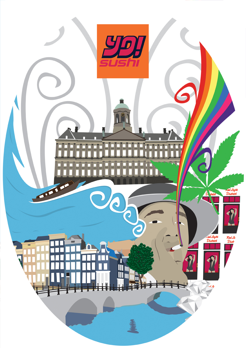
I thought id show you this as it shows ideas that i havent put up on the blog such as the weed leaf rainbow and the Warhol soup idea but with the windows hookers.
I had a few different looks as i was moving things around but nothing special to show however i did get to a point where i liked what i had done.
This is the first one..
I really like this design, it looks like the old one but with big tweeks. I was having problems with; the royal palace, the hookers and the weed smoker as i just couldnt get them all to look good, i got the hooker and smoker placed well but then the royal palace couldnt fit anywhere but in this they all work great together. I added the marijuana leaf as i find the shape of the leaf is amazing and as its a vector it looks great when its big, the spiral vector lines where put there to fill in the gap but i think it works nicely and suits the rest of the mural and finally the hooker girls are presented differently because i started thinking about the quantity of them and how it is always mentioned and so i thought this Warhol Campbell's soup theme looked much better.
I tried it in black as well...
The reason for the black is because Amsterdam has a lot a marijuana and shrooms are legal as well so i want to make look tripp-ier and having a back background gives the design some depth and makes the colours stand out much more, im still undecided which background colour to have.
Another idea i have was to change the shape of the design and here is what i came up with..
This was the rounded edges look but it was basicly the same so this is scrapped however i change the shape to an oval and really liked it, i did 3 versions with different backgrounds..
I really like this shape but i feel it cuts out too much and therefor im not going for this but i will develop it more on the side.
Finally i created this one, you would of sen this on my play surface(see above)...
In this one everything is more bigger especially the Royal palace and the best thing i like about this one is that there are not as many gaps as the old ones but the big images may be too big and there is a lot cut of this design most of all being the royal palace... I think im nearly finishing though which is great and for the mural i might add some nature and scale things down.


No comments:
Post a Comment