Monday 29 November 2010

Direct mail part II

Today i glanced over at the work i did last night which was the whole of my direct mail and i saw a few tings i wanted to change; on the front i wanted the orange bowl to be deleted due to me not liking it and the mid section didnt feel right and i just couldnt work it out anyway cutting a long story short i printed a test and put the booklet/card together and saw that it looks like theres a page missing and that they dont work together, i had ideas on putting in an extra page and i even drew what it would look like..

PICTURE HERE

The only thing that stopped me was that i couldnt work out how i would add just one double sided sheet (15cmx15cm not a double spread) into the booklet and with time running out i thought that it just wasnt going to work with the limited time i have left and so i decided to give the middle a makeover.

The information bowl looked very plain inside and i thought aout adding icons..
This would of been the home icon, i then had the phone and a pc screen and the earth for the internet but after creating the house styled in the theme of amsterdam which is shown below..
I felt that the icons didnt look that good and there became a feature i quickly disliked.

I began work on he makeover and this was the first nice looking style i got to..
You can see where im trying to go, im trying to get it to merge as one image rather than 2 seperate pages. This design is a bit too simple and so i developed it more and i got this..
In this design i changed the type of the left because you already know its YO! Sushi because you have seen the front and it doesnt need repeating, i replaced it with a short sentence that runs of the different world theme, the sentence implies that this sushi is out of this world and its the best in our (the publics) world. I made the information bowl part of the design by firstly continuing the water across the page and having the bowl looking like its float on the water by adding a shadow/reflection. Overall im very happy with this its much better than before, the only thing i still dont like and im not too sure if i will update is the information in the bowl.

Direct Mail

So i now move on to the direct mail first off what is direct mail?
  • Postcard
  • Leaflet
  • Brochure
  • Flyer
  • Booklet
  • Business card
Before even starting this i looked at YO! Sushi advertising and found these..
YO! Sushi's style seems to be very playful which is good because ive got a very playful city to design for! They seem to use vector, type and photos in their advertising and a lot of orange and white.

Anywho.. I did a front cover of my own and this is completely different to the YO! style as it fits the logo but it makes more sense when you see the inside. I chose to do a card type of design (greeting card style) which has a front, a back and 2 middle pages, the size is 15cmx15cm as i think a square is a much better shape than a rectangle. This is the front..
The orange bowl may come out as im not too sure on it.
After designing this i thought its not much of a creative front but the reason its like this is because when you first glance at it you will see the bright colours which will grab your attention, when you open it you will then be overwhelmed with colour. The slogan if i decide to use it will be "Step into our world" this means that you enter a new world when you come here because its unique and there's nothing like it, also it plays off the drug side of Amsterdam as its a "trip", a new world.

This is the first idea for the middle parts..
The first page introduces that YO! Sushi has arrived and the size of the text is large so its the first thing you see. The font is Rockwell which is the same as the logo, the different shades of orange in the background came from an old YO! Sushi advertising campaign (see above), you have a small sentence this again was on an old advertising campaign and so i thought id update it. Overall the first page is bright and colourful like i wanted it but im not too keen on the orange in the background and something about the whole page doesnt feel right so im going to develop it more. The second page is photos of the restaurant as its always nice to see where your going especially when im going to be using the words "step into our world", i want the customers to be excited not nervous and paranoid about what to expect however i feel these 2 pages together causes alot of clutter and therefor i think im going to put the images of the restaurant on the back page.

I developed the concept above and my middle page now looks like this..
Just looking t it and you get a better feeling than the previous one. On the first page i changed the background colour to a better colour (i cant put it any other way), the pale yellow on the old one wasnt nice to look at but this blue/green is much better it also gave me an opportunity to ad more colours unlike the yellow to orange. The short sentenced is deleted to make way for the smoke from the mural as i feel the design suits YO!'s style especially the colourful plates i added more plates and i changed the "IS HERE" to the colour of one of the plates because i started thinking why dont i just use colours hat they use for plates as its much easy to recognize in the long run. The second page was originally going to be the back but i changed ideas and put it here, this page is the information page as its just opened and most people wont have a clue where it is therefor its a necessary. The page has; address, telephone number, website and opening times, this information also means people may hang on to this unlike the other direct mail which would be thrown out, this card design means you can either have the front and back as the front and back or flip it inside out and have the middle pages as front and back, you then pin it up on your wall or keep it in your draw. Nice designs + useful information = a keeper.

The back of the card is the images you saw before..
I thought id add this text because i think it gives it that sparkle that it needs. I was very conscious about how the text will stand out e.g. i didnt want to use a one off shape that isnt used anywhere else, but i realized i used a rounded box for the opening times and that was because they use the rounded boxes on their website and therefor i used it.

The whole concept behind this design is that you get this through the post, open it, you see the black front with just the new logo and "Now open" and you have no idea what it is until you realize you can open it, you open it and you see the amazing colour design within and it is like going into a new world, you then see the information, you see the site, you either look at the site or look at the back and you re bombarded with this message that YO! Sushi is here and that its a unique new place - a new world and its unlike any other. All of it added together should create an interest straight away and then you pin this up on your wall or you can even stand it up!

Logo Development

Ive already got the YO! Sushi part done and now i need to add the "Amsterdam" part.

I went through a few typefaces that i thought represented Amsterdam well, could be used in different situations e.g. direct mail, menu. The typeface had to work good if it ended up being a neon sign so that meant that complex fonts werent acceptable.
These are the typefaces are narrowed it down to..
I really like Bebas Neue as its a strong font and the capitals look great, the font also rminds me of the building in amsterdam and haw they are so colose to each other and the tallness of the font reminds me of the buildings, Rockwell Extra bold is my favourite as i like the parts at the bottom of each letter and it could represent the reflection in the water and the rest of the letter are the buildings, the rest are ok but nothing really stands out. The Rosewood Std is amazing but i dont think you could have that font on a neon sign and so i cannot use it, the same goes for Lapointes Road it was better than the rest but when i had to choose the one i wanted it didnt fit the criteria.

The chosen font is.... ROCKWELL EXTRA BOLD!
This font has a thinner font styles and i could use this in their advertising and menu's.

Sunday 28 November 2010

Next up... The Logo

"Using the existing Yo! Sushi logo you are required to apply elements of the city's 'brand" ethos.... Each brand extension of the logo for your chosen city, should include the name of the city or town.... The existing logo is to be used but with a new typeface for supporting elements that will allow consistency and uniformity across the company's signage, lettering and typographic style."
The brief.

This is the logo Yo! Sushi have at the moment..
Very simple, nice bright colours to see and an all round nice logo to have.

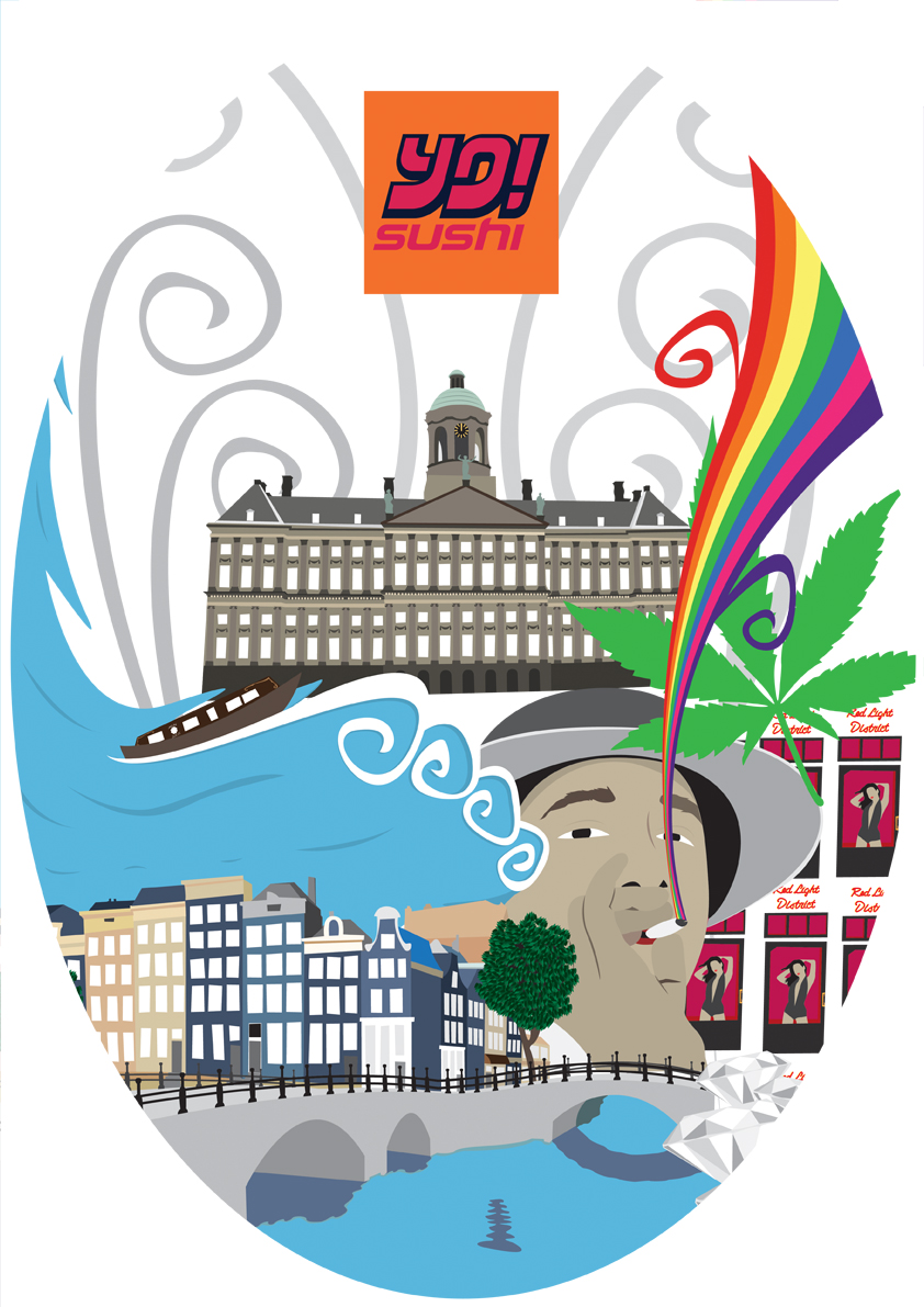
Anywho i have to create a Amsterdam styled logo, the logo must have something that can relate to Amsterdam and this is harder for me as i dont have a easy city e.g. London or New York and i dont ant to have any drug related images on the logo as the target audience is so wide some may not appriciate a cannabis leaf.
First thoughts were:
- Background is in the shape of a building
- There is a partition at the bottom and then a bridge
- The logo looks like a window
I got very frustrated with this logo idea as nothing really stood out but i thought i may aswell try and maybe it will come out better... I tried the first idea and this is what it looked like..
I did this and thought what the hell have i created, it looks nothing like a building and the gap looks terrible and the font doesnt go. I tried have 3 houses above but it still didnt work and so i scraped the 3 ideas above and start thinking about what is Amsterdam..
What is Amsterdam?
- Nightlife
- Creativity
- Ethinic
- Nature
- Water
- Boats
None of my thoughts made sense but i then had an idea for the font, i did a red light district neon vector in my mural and i thought i could do the "Amsterdam" in neon and so i carried on thinking "ok what about the rest" and then it hit me, why not all neon? The neon plays of the red light district and the moulin rouge lights but it also combines a Japanese taste to the logo as it will be neon and Japan is full of light based signs. In my head i had an image of a sign outside the Yo! Sushi bar which is actual neon and lit up.
I started looking at neon signs before i started so i could do a neon effect as i have never played with neon before..(source: http://abduzeedo.com/awesome-nostalgic-neon-signs)
My own tips for myself when looking at these so i can have a good neon look:
- The neon tube is lighter than the light produced
- Different syle of neon
   - Tube that can go all the way around the image
   - Tube that can only go in sections so there are gaps
- Some neon signs have a backboard with the lettering in solid colour normally white
- Neon is just the outline and not the fill

I looked at a few tutorials and different neon fonts..
Tutorials:
http://www.photoshopsupport.com/tutorials/cb/neon-sign.html (not what i wanted)
http://layersmagazine.com/night-lights-creating-a-glowing-neon-effect.html (Good but i felt i could do it another way)
Fonts:
http://www.fontspace.com/category/neon
They didnt really help me out much...

I thought to myself after looking at the tutorials and fonts that i have the capability to look at the images and recreate it by myself.
My first idea was the have a single strip of neon in each letter...
I liked the idea and the neon works really well but before i move on i had another idea of having an outline instead of doing the fill (sticking to my own rules).

This is my second idea, the idea is that the neon is a style where it cant go all the way round and has that neon look to it, it also goes round the outline..
I feel this is much better than my first idea and so im scraping idea 1. I have a few problems with this, the first being it looks very cartoon-y and not very neat but it does look like a neon sign however i was thinking about having a neon strip over each outline or letter in solid colour behind the neon but im afraid that it might take the focus away from the neon.


My third idea is to have neon that can go all the way round each outline, i also changed the shape to landscape and no orange outline..
This is much more like it and when put with the other two it puts them to shame, this looks professional, aesthetically pleasing and much brighter. I still have to add amsterdam into the logo but i have done the Yo! Sushi part and i really like the neon effect.

To get the neon effect on each idea i created the path in illustrator, brought it into photoshop where i added a colour overlay to the line, an outer glow and following the rules what i found out from my neon sign examples i was able to get the colours right.

The Mural

SOOOOOOO its here! Yes! I have (kinda) finished it! 

I was still deciding on certain sizes of vectors and filling gaps in but i have got a design that i would push for print.
This has come out fantastic! I started getting to a point where i was thinking its too cluttered and you eyes just wandered but i think i have fixed that now.
Your eyes now start at the royal palace and then are dazzled by the colours and you find yourself lost in the design.
I added marijuana leaves behind the hookers as i tried different solid colours but it didnt look right and so i had a small idea of utting leaves there and it worked nicely, i made the royal palace smaller because the right side was cut off before making it seem unbalanced, i added clouds and changed the background colour to blue and the main reason for this was because whites too obvious, blacks too dark but this nice sky blue gives off a positive vibe and clouds are always a nice feature plus you cant have water without clouds. I may change the colour of the spiral lines, i still need to add the statue at the top of the royal palace and i will add a bike or two.

What the mural covers:
- Amsterdam architecture.
- Amsterdam streets
- Canal
- Bridges
- Nature
- Diamonds
- Red light district
- Marijuana
- Art (colours and style of mural)
- Royal Palace
- Boats


Still to add:
- Bikes

Saturday 27 November 2010

Make Over

Im getting to that stage now where ive looked at this design for so long that im starting to not like it, this always happens and so i started playing around with the vectors i created as im not going to do much more.
Heres my playing surface..

I thought id show you this as it shows ideas that i havent put up on the blog such as the weed leaf rainbow and the Warhol soup idea but with the windows hookers.


I had a few different looks as i was moving things around but nothing special to show however i did get to a point where i liked what i had done.
This is the first one..
I really like this design, it looks like the old one but with big tweeks. I was having problems with; the royal palace, the hookers and the weed smoker as i just couldnt get them all to look good, i got the hooker and smoker placed well but then the royal palace couldnt fit anywhere but in this they all work great together. I added the marijuana leaf as i find the shape of the leaf is amazing and as its a vector it looks great when its big, the spiral vector lines where put there to fill in the gap but i think it works nicely and suits the rest of the mural and finally the hooker girls are presented differently because i started thinking about the quantity of them and how it is always mentioned and so i thought this Warhol Campbell's soup theme looked much better.
I tried it in black as well...
The reason for the black is because Amsterdam has a lot a marijuana and shrooms are legal as well so i want to make look tripp-ier and having a back background gives the design some depth and makes the colours stand out much more, im still undecided which background colour to have.

Another idea i have was to change the shape of the design and here is what i came up with..
This was the rounded edges look but it was basicly the same so this is scrapped however i change the shape to an oval and really liked it, i did 3 versions with different backgrounds..
I really like this shape but i feel it cuts out too much and therefor im not going for this but i will develop it more on the side.

Finally i created this one, you would of sen this on my play surface(see above)...
In this one everything is more bigger especially the Royal palace and the best thing i like about this one is that there are not as many gaps as the old ones but the big images may be too big and there is a lot cut of this design most of all being the royal palace... I think im nearly finishing though which is great and for the mural i might add some nature and scale things down.

Vector Smoke

Since doing the guy smoking ive been trying to create vector smoke but i just cant get it right, smoke is simple todo but i want this to be different and to have an unusual look and feel.
I started by doing my own smoke but this turned out to look terrible..
And so instead of thinking i could do it straight away, no problem, i started to look at other smoke vectors..
I liked this one because it was different and it gave me an idea to write "AMSTERDAM" in smoke but it wasnt what i wanted.

This kind of smoke was the most popular when researching but it has gradients and opacity levels which none of the mural has and so it wouldnt fit.

This image really caught my eye and i thought this would work perfectly! It is a bit tribal but if i do it my own way i think it wont look as tribal. I decided to go with this tribal looking design but when it came to actually doing this i felt it wouldnt work as well as i thought, the problem wasnt in the window but when it comes out of the window, i want it to be not to bulgy and thick because it wouldnt match up with the slim waterfall at the other side.
As you can see i only did a rough design of what it would be but this was because i started to dislike the idea... Back to the drawing board.

After being constantly annoyed by this smoke i went back to research and thought they must be something out there to help me with this and to my luck i did, i found these two images..
When i saw the first one i came up with the idea to use colour instead of boring, dirty grey, this way it makes the smoke seem cleaner and better. I couldnt use the circle idea as i didnt want to copy but i then found the second image and i love the shapes and curves of the vector lines and so i combined the two together..
I think it looks much better than normal smoke and it relates to marijuana more, the unusual curve at the top where it looks like its spreading out was an accident as i did something wrong and that is what came out of it never the less im taking credit and i like the smoke finally!

Saturday 20 November 2010

UP TO DATE

The blog is now running along side my work rather than being behind like before!

The Royal Palace

So after spending the longest i have ever spent designing an outcome i thought it should take any longer... How i was wrong, i now need todo the Royal Palace and this isthe image im going to base it off.
 This is gonna be my Everest but once done it will look AMAZING!

Development of the vector
After 3 hours of solid path building this is what it looks like..


BIG PROBLEM!!!
I spend another 3 hours on this and get it finished but im about to copy it into photoshop to save it with just outlines and my illustrator crashes.. doesnt sound that bad but the 3 hours extra work that i did, i hadnt saved it once and so after 20 minutes of trying to get it to work i lost all my work and had to restart at my last save point which is the picture above. MY lesson learned ALWAYS SAVE!

Being very annoyed at mac crashing i didnt do anywork all day but yesterday i finally got back to it and finished it and my my its amazing.
The outline before colouring...
The coloured version..
Im really happy with this after spending 9 hours doing it (3 hours lost), the top statue im still yet todo and i may add more detail but i think this can be the UMPF i need.

New Sketch

After getting this far i had a rethink on the mural, im keeping what i have but what i need im going to rethink and in doing so i created another rough sketch.
Its extremely rough but my ideas were all muddled and i got them down in the way i wanted as quickly as possible before i lost my thought process.

The changes!
- Now i moved the windows from the middle the the right i now need a main image under the logo and so im going to use the Royal Palace which is a big trademark and this should give methat UMPF! i wanted.
- Up the left side there will be multiple windmills.
- Under the windmills will be the Rijksmuseum - another landmark.
- Up the right will still be the smoke but no windmills (ignore the one in the smoke as that was an error).
- Around the Royal palace and throughout the top part will be trees and flowers.

The Windows

The 2 windows need filling as im scrapping the old hooker as she wasnt too good.
1st window needs a seductive hooker
2nd window needs a gut smoking a joint

The 1st window - The Hooker
I was thinking about this and i remebered when i was around 14-15 i had a really nice background on my desktop of Christina Milian (singer) and instead of referecing an actual hooker why dont i look at beautiful girls modeling, this got me thinking as everyone tells me all the hookers there are 10/10's and therefor i wanna do this.
The image i was thinking of was this...
I dont want to say she is a hooker but she is beautiful and this image and body is very seductive and im going to use this as my hooker.

This is my vector of her..
I havent put much detail in her as i dont think there is need to, im really pleased with the hair as thats a main feature, the shapes looks good and the clothing but the best part for me is the lips, i didnt put any facial features on as then theres too much to judge but these amazing lips make you fill in the rest therefor shes everyones type. The colours arent the finished colours. I didnt put her kneeling as i want her to stand up instead.

The 2nd window - The Spliff Smoker
Ok. im not too sure what i want for this.. One thing i would like is the hands upto the face as if you smoking and its pleasurable e.g. the hand its spread out whilst you smoke the joint. THat would be preferred but if i cant get that i would like some type of image to go back to where the smoker is enjoying the joint.
Some images of people smoking joints.
I couldnt find many images that would fit what i wanted such as; angle and how they are smoking it.

The middle image is ok, the top image has given me an idea to think about how much smoke there is and this is importnt as its seen as more smoke more stoned and as its legal you would have a good time with it and so i may put alot of smoke behind the smoker. The 3rd picture wasnt what i wanted but it has the hand like i wanted them and so im going to do a vector of this.

My vector of the image..
I fairly pleased with this, i think the colours can be redone but apart from that im happy with the style of this as it fits in with the rest of the mural.

SOOO the windows are done and this is what it now looks like..
So far so good but along way to go.
About 10 hours spent on this now*
 (*creating time not researching and developing. )